✳ Concept, illustration, UI, motion and development for Flemme Tea.
KEY VISUAL / A LITTLE LESS HURRY
01 — THE SHOPPING EXPERIENCEFLEMME / LIVE STORE
ONLINE STORE · LIVE
The shopping experience
Everyday tea, at your own pace.
A look through the live online shop, from the tea shelf to a tea bag with Genmaicha inside. The little physical shop in Gifu is planned for 2027.
FLEMME TEA / ONLINE01 / 04
ONLINE STORETea shelf
01 / THE SHELF
Start at the tea shelf.
A small selection of everyday Japanese teas, with room to find a familiar cup.
THE SHOPPING EXPERIENCE / MOBILEINTERACTIVE STORE DEMO
Tea, in your hand.
Explore the shop inside the phone. Each view scrolls automatically; choose a step or interact with the screen.
09:41
FLEMME TEA / MOBILE01 / 04
Tea shelf
Interactive portfolio demo based on the live store. Tea-bag changes stay inside this demo.
02 — THE CONCEPTEVERYDAY, NOT ORDINARY
THE IDEA BEHIND FLEMME
Rest is something you can bring home.
On a farm in New Zealand, the founder met someone who could switch off completely during a break. That feeling stayed with her: flemme.
It echoed the everyday tea-and-snack rituals she knew in Japan. Working in a Dutch matcha café brought the idea closer to a place of her own, with a return to Gifu planned for 2027.
JapanEveryday tea
New ZealandPermission to rest
NetherlandsA cup to share
Gifu · 2027A planned return
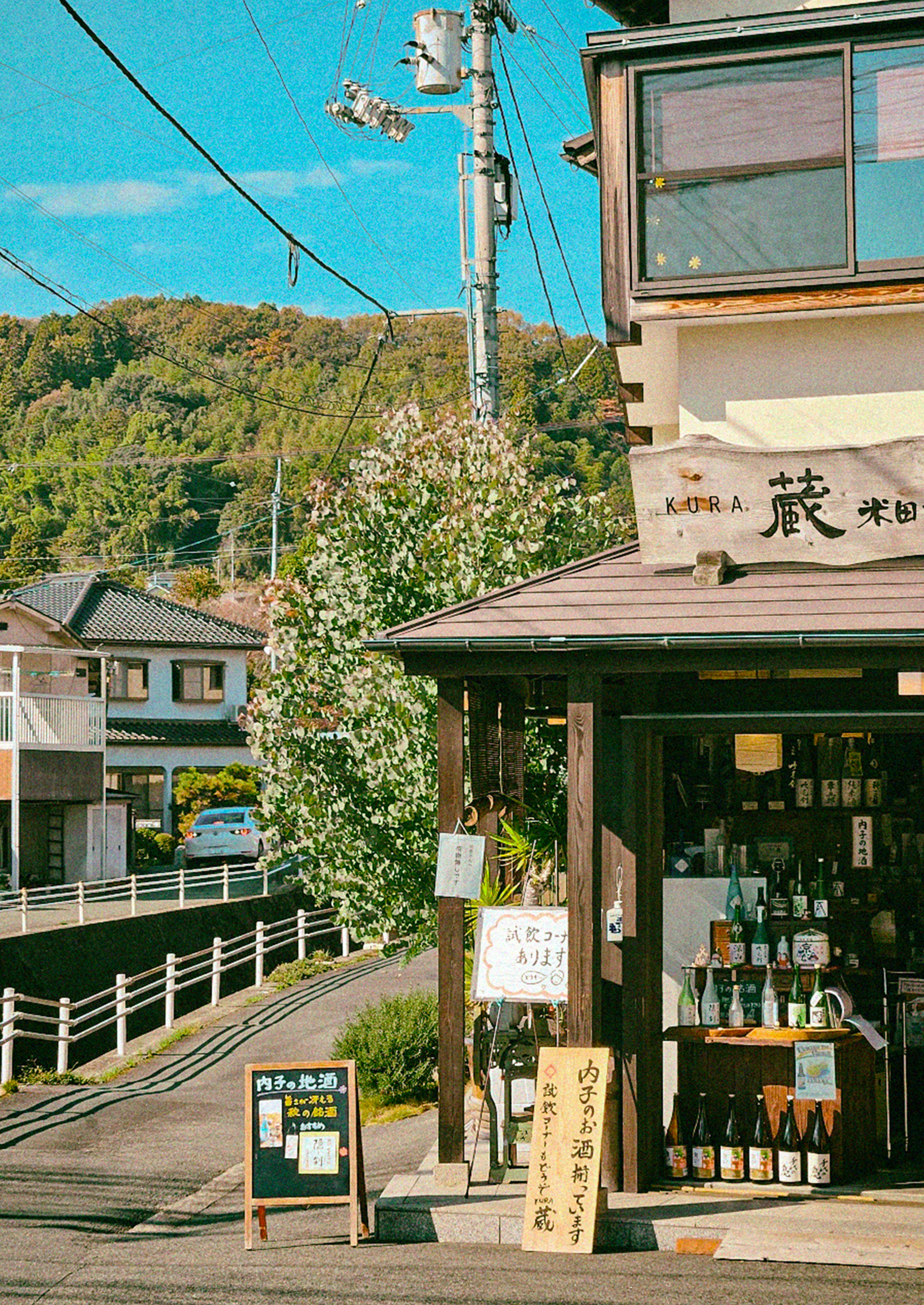
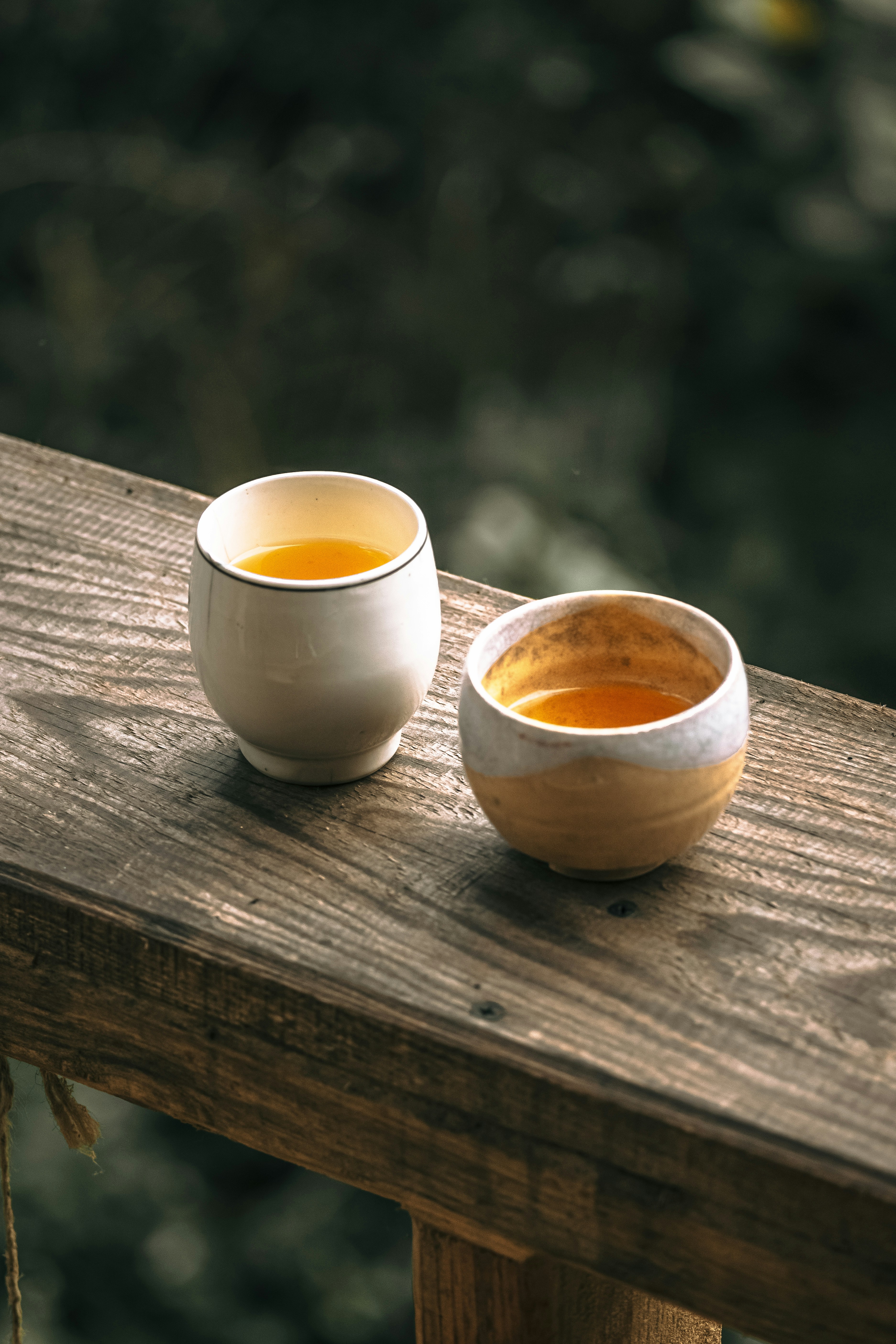
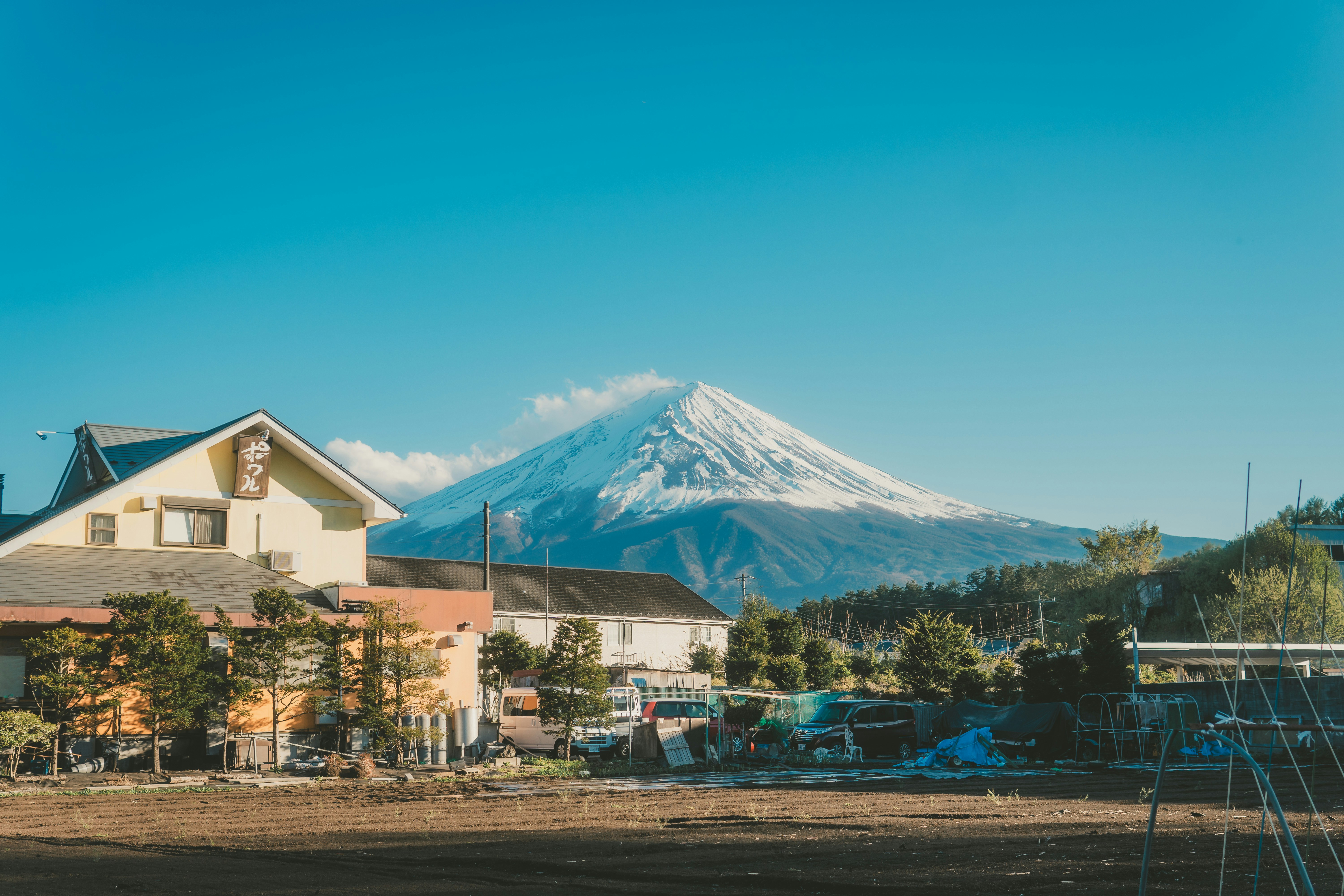
日常のお茶A shop on an ordinary street.Time for two.Sky, rooftops, a slower pace.
NOTES ON A FEELING
From place to ritual.
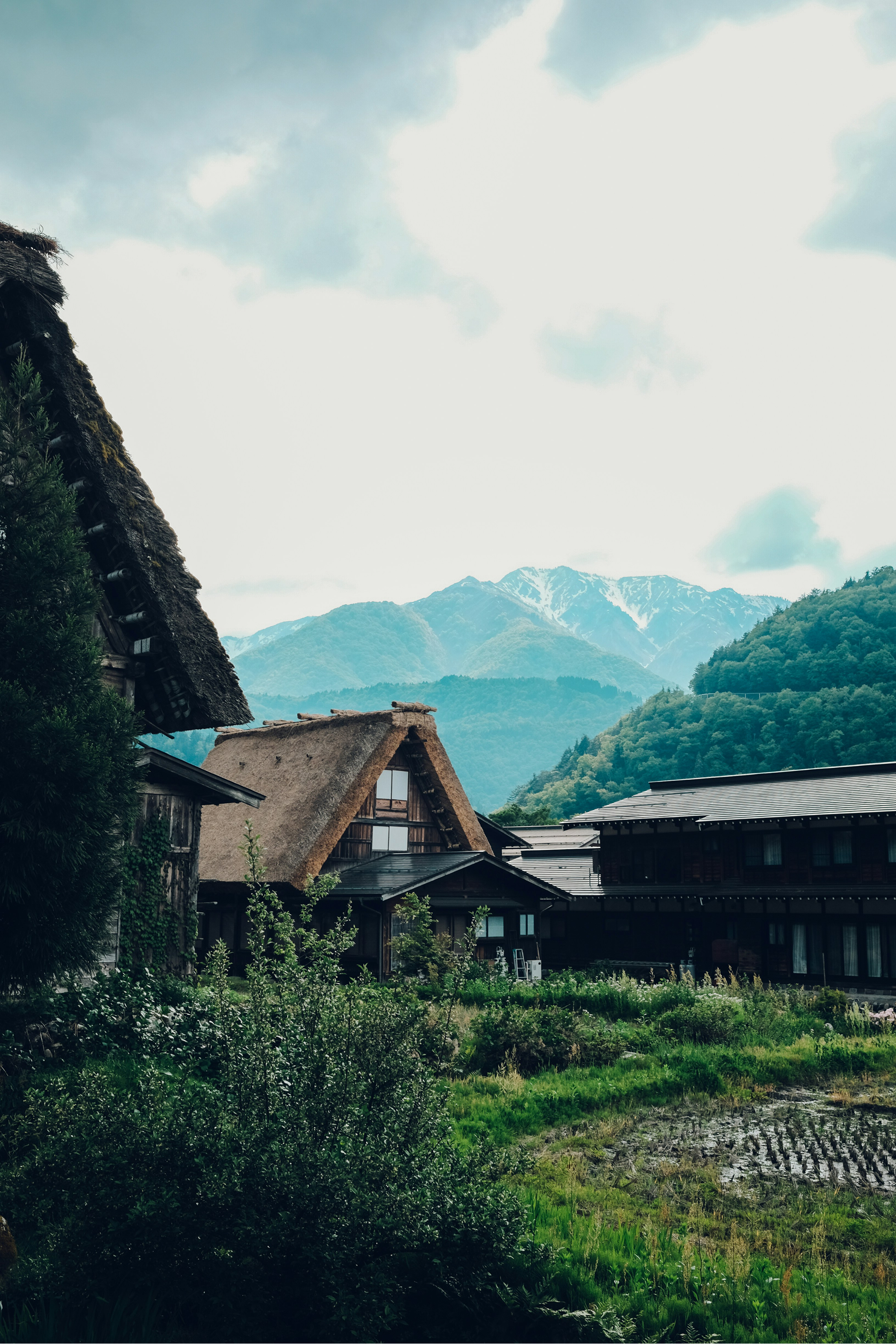
Landscape, streets and shared cups bring the idea close to daily life.
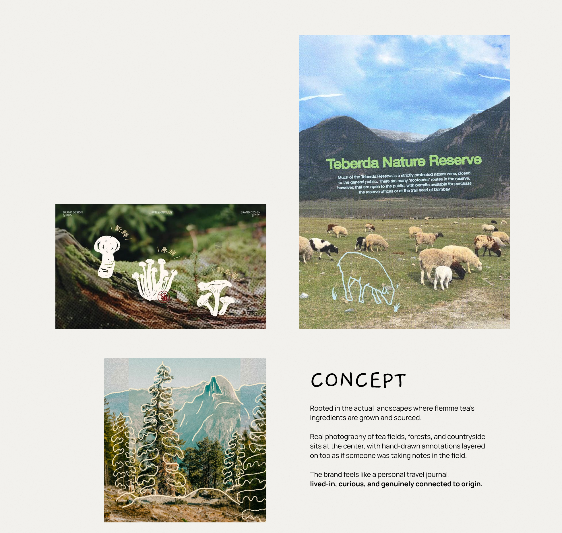
THE VISUAL REFERENCESOpen the moodboard ↗
VISUAL REFERENCES → DESIGN PRINCIPLES
Borrow a principle.Find a voice.
Keep the real. Photography anchors the scene in everyday life.
Add the imagined. Drawing introduces a person, gesture or small story.
Leave room. Open space lets each image breathe.
Reference material · not Flemme applications Open board ↗
03 — A SHARED VISUAL LANGUAGEFROM LINE TO CHARACTER
One world. Many small stories.
Uneven ink. Familiar places. Just enough detail to feel at home.
THE MAIN ILLUSTRATION
A place to call home.
A tea shop drawn with familiar details.
TEA SHOP ILLUSTRATION / A PLACE TO REST
FARM · NEW ZEALANDRoom to pause.
CAFÉ · NETHERLANDSA cup to share.
THE LINE, UP CLOSE
The decisions inside the drawing.
Enlarged details from the tea-shop illustration.
A loose rhythm
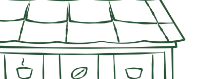
Roof panels repeat, but their edges vary. The silhouette holds the structure together while the line keeps the hand visible.
Recognisable, with less
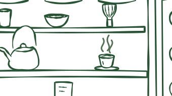
The kettle keeps its handle and spout; cups keep their open rims. Surface detail falls away so the objects remain readable within the shop.
ONE LANGUAGE, THREE ROLESScene
More detail for the tea shop: objects, shelves and curtains give the place its character.
Gesture
Fewer lines for a person or cup. Keep the pose and silhouette readable at a small size.
Note
The lightest marks sit in the margins. They guide attention without competing with the photograph.
TYPE & COLOURTYPE / COLOUR / APPLICATION
Typography & colours
Gaegu
Weight
Regular 400
Uppercase
ABCDEFGHIJKLMNOPQRSTUVWXYZ 0123456789
Lowercase
abcdefghijklmnopqrstuvwxyz 0123456789
TOGETHER ON THE HOMEPAGE
Flemme Tea
Japanese everyday tea
About Product Atmosphere
Gaegu carries the welcoming voice. Manrope keeps navigation clear.
Gaegu gives headlines and notes a personal, handwritten voice.
COLOUR / FROM LANDSCAPE TO TEA TABLE
The field, the wood, the open sky.
Green connects tea and landscape; brown adds warmth; blue leaves room to breathe.
01 / TEA GREEN#84944D
Fields and tea leaves make the green feel familiar.
02 / WOOD BROWN#52371A
Warm wood grounds the everyday tea table.
03 / SKY BLUE#7AAECB
Open sky gives the palette room to breathe.
Brand typography pairs Gaegu with Manrope.
THE SAME LANGUAGE, IN MOTION
A journey, drawn in chapters.
Japan → New Zealand → Netherlands. Then, a plan to return home.
ARRIVE
Draw the scene once, then leave it complete.
BREATHE
A small movement in steam or fabric keeps the place alive.
REST
Long holds give stillness as much importance as movement.
01 — 04
01 / JAPAN
The familiar things.
Everyday tea culture. A small ritual to carry along.
a little piece of home
A walking character. A swaying curtain. Steam from a cup. Small movements, room to rest.
06 / SHIPPED · LEARNING
A live shop. A next chapter.
The online store is live today. A small physical tea shop in Gifu is planned for 2027.
SHIPPED ↗
Online, and ready to explore.
Flemme Tea’s live online store brings the illustrated brand, tea selection, product details and brewing guidance together.